Segmentation has always been the raison d’être for analyzing data. After all, analytics is greek for “breakdown”, and businesses are trying to breakdown data into segments that can reveal ideas to serve customers easily. Understanding data segments reveal the kind of customers who are discovering your online media…and thus, discovering if your business is a good one to do business with.
But when it comes to data segments created from traffic sources to a site or app, mobile data drives the heart of the analysis especially if there is an Internet of Things influence in the strategy, such as beacons in a retail location.
So how can a business direct its analysis to make an IoT strategy better?
The best answer comes from combining Affinity reports and second dimension to know where people are coming from when they arrive to your site and to learn how people journey in general.
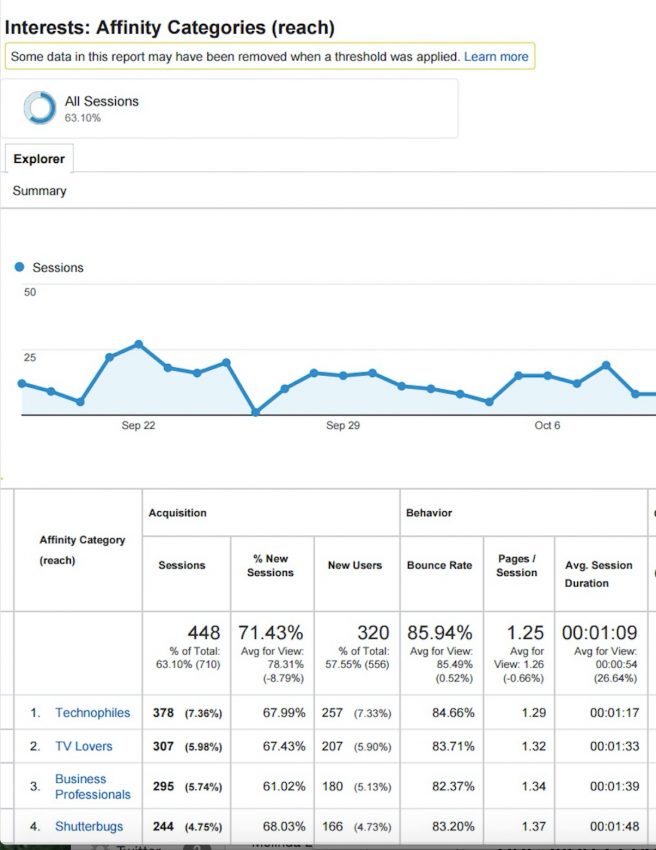
Affinity reports are useful in discovering new sites and topics that customers hold an interest.The Affinity and In-Market Reports offer lifestyle (Affinity) and purchase-intent (In-Market) topics that attracted an audience to a measured site or app.
But sometimes reviewing Affinity report results on one dimension does not reveal a pattern or a trend that tells the user something meaningful. Selecting a relevant second dimension can help reveal more information to help the user see a pattern and make decisions. (This Zimana post talks about second dimension selection in more detail.)
So where to start first?
Go to an Affinity Report and determine what topics are typically of interest to your site traffic.
Next set the Second Dimension in Affinity Reports to one of the following, based on the purpose of what associated information appears with the results in the Affinity Report:
Device
Time
Age Range
Verifying attribution can help you see if your media usage is in step with an target audience or within your industry. You can do so with the Google Customer Journey Tool (I explain how the tool works in my CMSWire post - Pierre). The purpose of the tool is to see how customers general use different channels in a sequence before they purchase.