General Assembly invited Zimana founder Pierre DeBois and Joe Anhalt, Marketing Manager at Spothub to discuss the current state of digital marketing. The talk with budding students and young marketers took place in Space, an office incubator in Chicago.
Watch these three video to gain tips on what goes on during a typical marketer's day, what is takes to develop the skills of digital marketing, and what are the latest trends impacting digital marketing today.
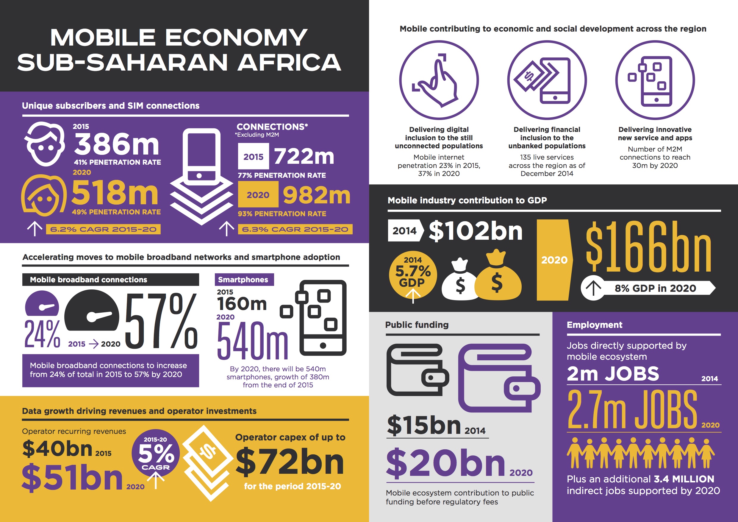
Mobile devices play a big part in internet usage, but they are more of necessity in places outside of the United States. African countries have been developing services with mobile phones in mind, since many have higher penetration rates among their populations.
I wrote about the leader in African Mobile in an earlier blog for UBM Tech - check out the post Mobilizing South Africa. But that was back in 2012, where SMS was a key communication delivery platform and smartphones had not fully penetrated the market.
3 years later smartphones are making headway, encouraging local app development and economic expansion. So says the latest report from GSMA, an organization representing uniting nearly 800 operators with more than 250 companies in the broader mobile ecosystem.
The team summarizes the report on their main page.
The mobile industry in Sub-Saharan Africa continues to scale rapidly, reaching 367 million subscribers in mid-2015. Migration to higher speed networks and smartphones continues apace, with mobile broadband connections set to increase from just over 20% of the connection base today to almost 60% by 2020. Falling device prices are encouraging the rapid adoption of smartphones, with the region set to add more than 400 million new smartphone connections by 2020, by which time the smartphone installed base will total over half a billion. - See more at: http://www.gsmamobileeconomy.com/ssafrica/#sthash.AQCHUEKK.dpuf
You can download a copy of the report as well as learn more about GSMA. An infographic is also available; You can view it below.
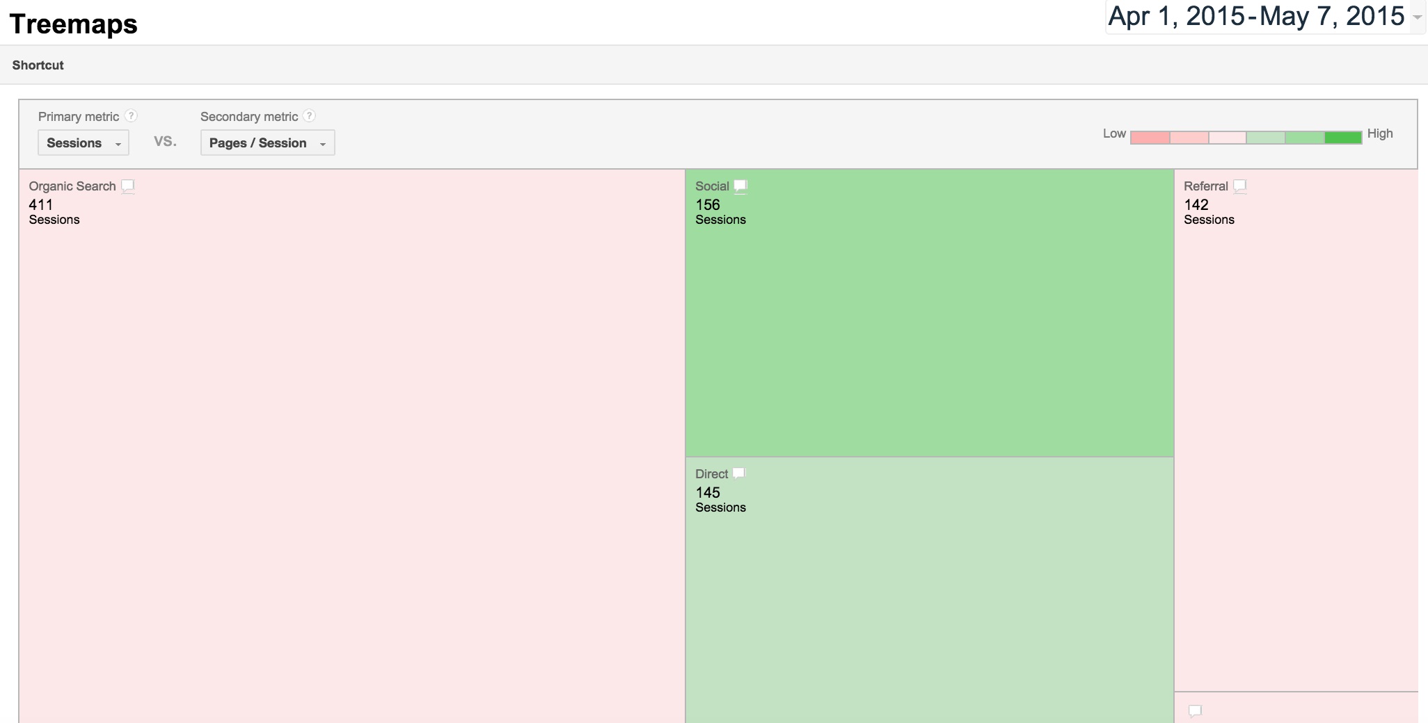
Google Analytics provides treemaps to permit a fast visual comparison of dimensions
Over the last few months, Google has introduced a treemap display in its Analytics suite. If the term “treemaps” is not familiar, then take a peak at the image below to learn what one looks like.
You may seen something similar, as treemaps have grown popular in news outlets to explain scale across several items. Treemaps appear as a large rectangle divided by smaller rectangles just like a pie chart. Each rectangle represents a dimension, while the size and color of each rectangle is dependent on a given metric or set of metrics.
Treemaps are meant to display data simply, just like a pie chart. But unlike a pie chart, a treemap allows convenient visualization with multiple pieces to quickly highlight the largest influence of a data set. The color and size of the rectangles are mapped into patterns that infer the significance of correlated data.
The simplicity of treemaps makes visualizing data subsets in a small display area easier. Because the rectangles are meant to establish a visually hierarchy, the magnitude of segments can be viewed regardless of the size of the overall treemap.
Google Analytics treemaps were added to the Acquisition channels so users can quickly and intuitively develop hypotheses about incoming traffic. The treemaps permit plots of volume metrics (like Sessions or Transactions) against any relative metric (like Pages/Session or Avg. Session Duration).
This setup allows you to instantly compare the performance of different channels based on metrics that are most relevant to you. Using such comparisons can highlight ideas for improved marketing and direct resources accordingly.
Chris Nelson, a software developer from Cincinnati, Ohio, presented an overview of the MeteorJS framework at the Angular JS meetup. The presentation was held at the DevBootCamp in Chicago. Chris has been developing web applications for about 15 years and helped found Gaslight, a collaborative workspace for developers and designers.
Meteor.js is an Javascript open source framework designed to ease the creation of applications. It, along with Angular.Js, have been receiving attention on the web as developers continue to experiment with Javascript frameworks. Developers are discovering proven value from these frameworks.
With respect to Meteor, its best feature is the capability to refresh in the browser as soon as developers modify the code. This decreased latency makes updates easier, and makes Meteor capable to operate as a completed standalone app.
Meteor's underpinnings are based on Node.js, and include a lite version of MongoDB database. This structure forms the basis behind data on the wire description and fast code updates at the browser. Chris indeed notes this, along with the potential to eliminate overhead, when covering the 7 principle advantages that Meteor provides. He also goes on to explain the application structure.
The videos are a bit older than this post, but robust growth of the development around Meteor continues. Just recently, the main development community supporting Meteor introduced Galaxy, a cloud-hosting solution for Meteor applications.
You can learn more about MeteorJS at the main site for the framework. In the meantime, enjoy these video segments (and excuse a bit of shakiness in the recording).
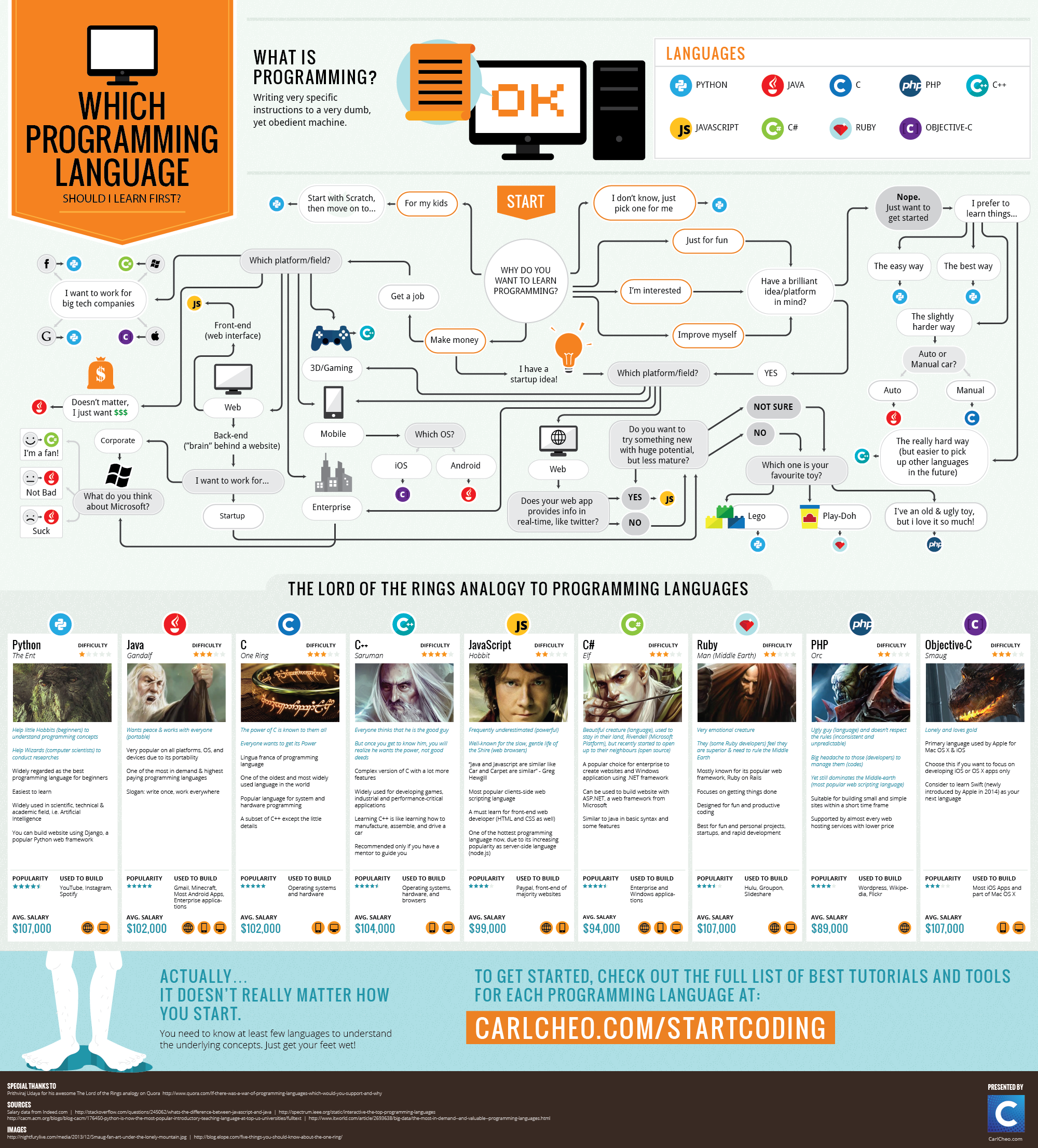
Like the infographic says, programming is "writing very specific instructions to a very dumb machine." However the kinds of programs available has grown, with enough associated frameworks to make anyone feel dumb.
This infographic takes a look at selecting a starting point with a neat flow diagram that considers OS, device, and interest. The creator, CarlCheo, is a tech blog that writes about a number of services, tools, and software, with occasional tips and tutorials.
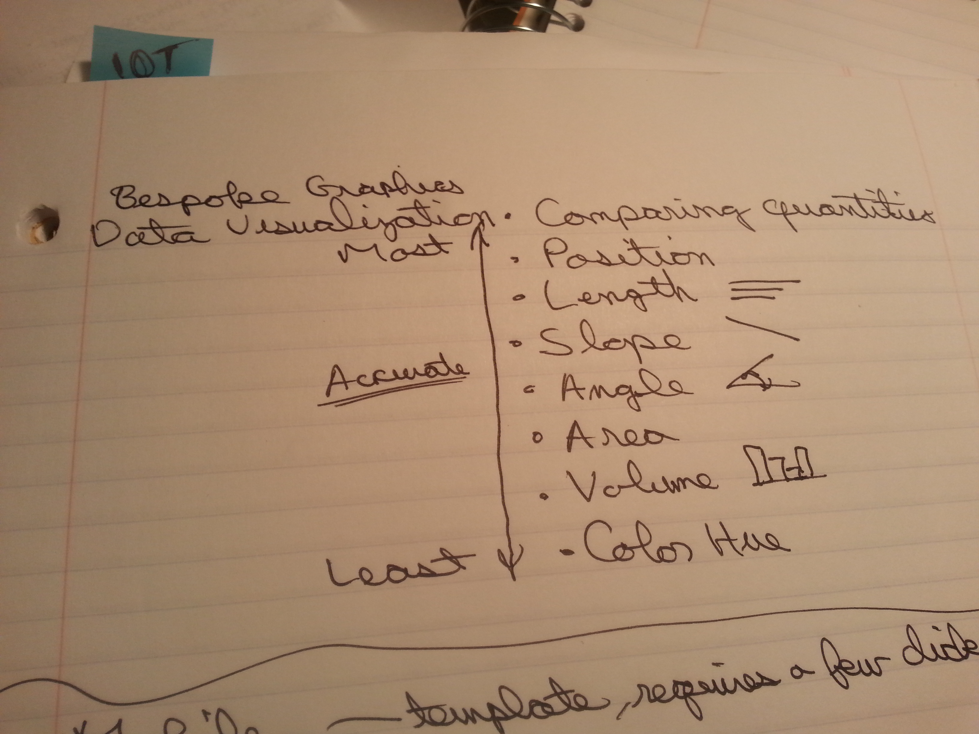
Take note of what makes the best way to display data visually.
Spreadsheets have their value, but they usually offer value for relative small batches of data. As more columns and rows of data are added, the ability to Increasingly difficult to process relationship among the data becomes difficult. Spreadsheets present visuals which only allow for isolating figures. People can't visually register but one or two numbers at a time. This is why many plugins use spreadsheets to highlight a change in value.